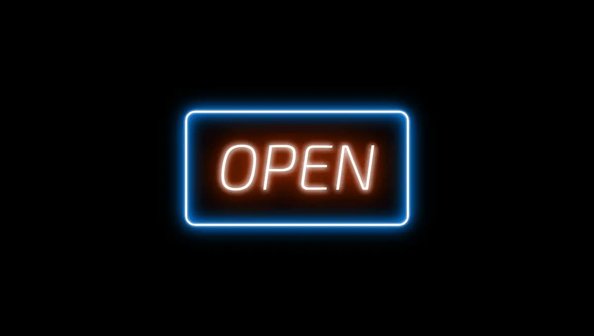
The CSS shadow effect can be deceptive but highly effective when put to use correctly to create an awesome CSS glow effect. It is a simple way to add effects such as shadows, glows, and rotational effects to a text, including images or elements. These effects are very useful in motion graphics, images for blogs/websites & in creating awesome designs for advertisement. But get tricky with it, and you can create some really interesting things with CSS glow effect. Have you used css loading effect in your site?
CSS glow effect can be used in creating ticking counters, pixel art, and 3D effects on text, and simple animations. It can also be used in drawing simple border lines, creating a CSS halo effect, emboss effects for drop-down menu, glow effects on DOM objects on mouse hover or when the cursor moves, creating a lamp spotlight leading up to the write-ups and cast shadow at its end, which is very useful when it comes to web design/development.
List of Top Free CSS Glow Effects
Today most web designers and developers make use of CSS glow effect to get some great results on different pages of their web sites, giving it a unique and distinctive look every site deserves. With it comes to a whole lot of glow effect or glow text effects, which are available for us to experiment with. In this article, you will see some of the best CSS glow effects you can implement or use relatively on your website.
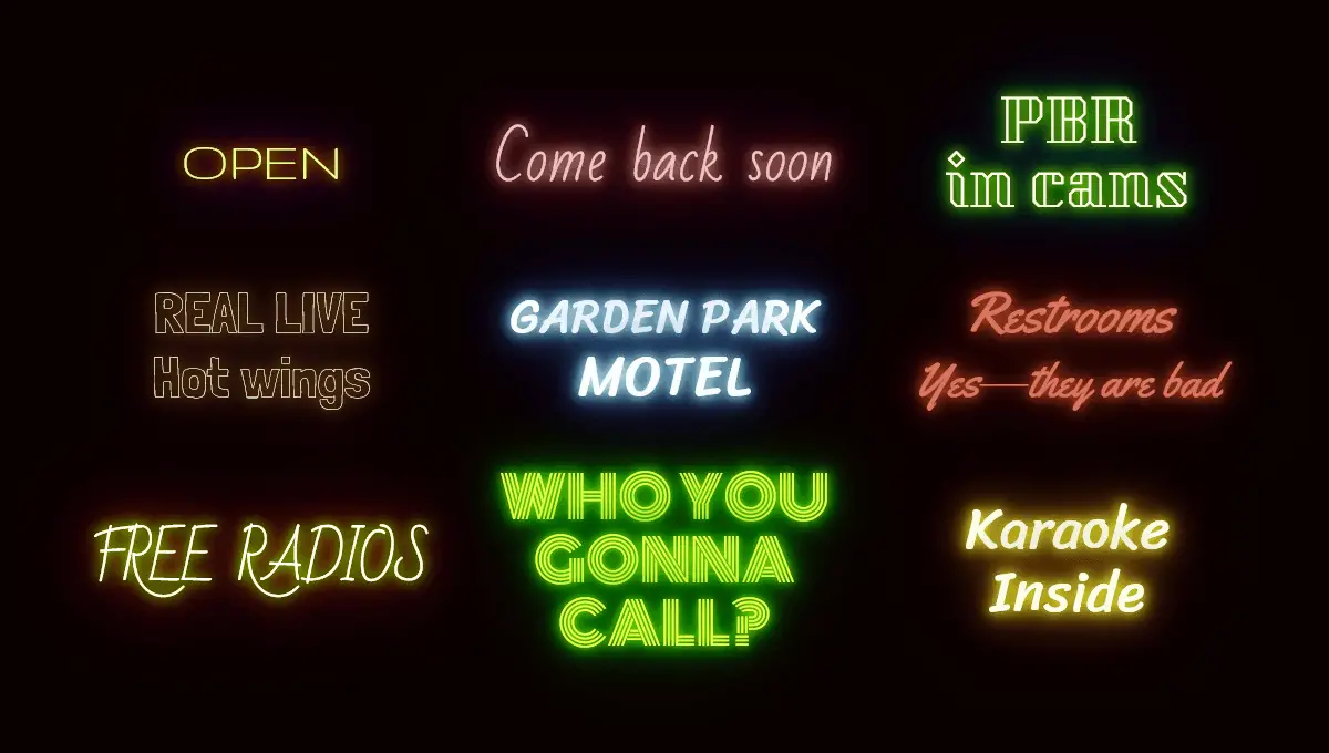
Shimmering Neon CSS Text Effect
First on our list is the Shimmering Neon text effect, it is a pure CSS glow effect, made of HTML and CSS combined. It has a flammable effect on the text on which it is applied, depending on the font type and it is fully compatible with Chrome, Firefox, Opera, and Safari.
[button-green url=”https://codepen.io/comehope/full/GBwvxw” target=”_blank” rel=”nofollow external noopener noreferrer” position=””]Demo[/button-green][button-red url=”https://codepen.io/comehope/pen/GBwvxw” target=”_blank” rel=”nofollow external noopener noreferrer” position=””]Download[/button-red]
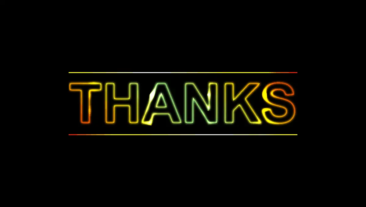
CSS Text & Box Shadow Flickering Neon Sign Effect
The Flickering Neon Sign effect is achievable using the CSS text and box shadow, whose properties can be animated in order to create the flickering neon sign effect. In this effect, the neon text and border color can be changed separately by simply updating their individual CSS values. The effect created glows from inwards to outwards of the text and border giving it the flicking effect needed and it is highly compatible with the Chrome, Edge, Firefox, Opera, and Safari browsers respectively.
[button-green url=”https://codepen.io/GeorgePark/full/MrjbEr” target=”_blank” rel=”nofollow external noopener noreferrer” position=””]Demo[/button-green][button-red url=”https://codepen.io/GeorgePark/pen/MrjbEr” target=”_blank” rel=”nofollow external noopener noreferrer” position=””]Download[/button-red]
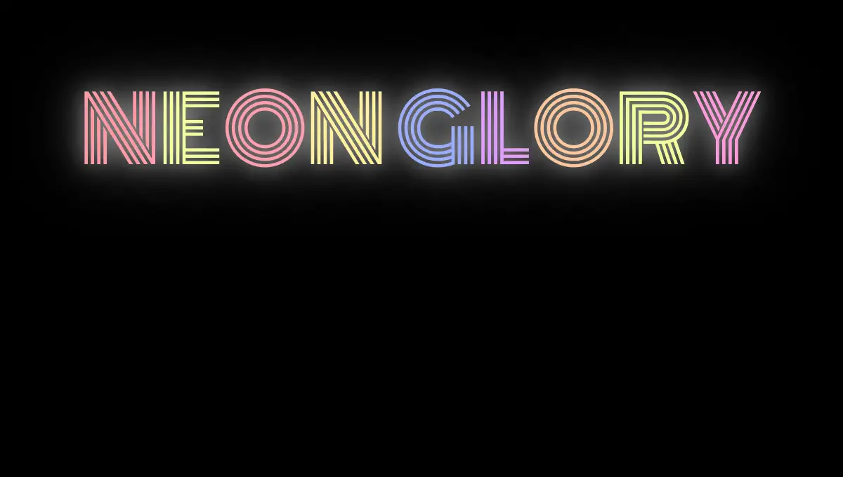
CSS Neon Effect – Neon Colors
It is an animated neon effect simply created using CSS or SCSS. It has a large glowing effect which surrounds the entire text areas giving it the desirable glowing effect needed. The text color can simply be changed by updating its CSS variables and it is equally compatible with Chrome, Edge, Firefox, Opera, and Safari.
[button-green url=”https://codepen.io/markheggan/full/LjrVYN” target=”_blank” rel=”nofollow external noopener noreferrer” position=””]Demo[/button-green][button-red url=”https://codepen.io/markheggan/pen/LjrVYN” target=”_blank” rel=”nofollow external noopener noreferrer” position=””]Download[/button-red]
Neon Text Glow Effect
It is a simple neon animated text effect in which the glowing effect can be controlled and directed. Either glowing from inwards or outwards pending on the preferences of the designer. This particular effect is equally created using HTML and CSS respectively and it is compatible with the following browser: Chrome, Edge, Firefox, Opera, and Safari.
[button-green url=”https://codepen.io/AllThingsSmitty/full/VzXrgY” target=”_blank” rel=”nofollow external noopener noreferrer” position=””]Demo[/button-green][button-red url=”https://codepen.io/AllThingsSmitty/pen/VzXrgY” target=”_blank” rel=”nofollow external noopener noreferrer” position=””]Download[/button-red]
Neon Text Flicker Glow
The Neon text flicker glow effect is a type of effect that allows you to control not just the glowing effect of each text but each letter, and colors of individual letters. It is created using HTML, CSS, and JavaScript. The most interesting part of this effect is, the text color can be changed to glow simply by updating its CSS script. It is compatible with Chrome, Edge, Firefox, Opera, and Safari.
[button-green url=”https://codepen.io/ganceab/full/YZvKLQ” target=”_blank” rel=”nofollow external noopener noreferrer” position=””]Demo[/button-green][button-red url=”https://codepen.io/ganceab/pen/YZvKLQ” target=”_blank” rel=”nofollow external noopener noreferrer” position=””]Download[/button-red]
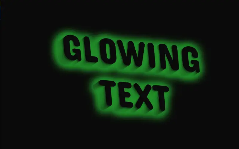
Bill Paxton Tribute – Glow Text
The Bill Paxton Tribute glow text effect is created using HTML (Pug), CSS (SCSS), and JavaScript, this allows text shadow glow irrespective of the background and color of the text. Apart from the text shadow, it allows a small or medium glow effect on individual letters of the text giving it a unique appearance. It is useful in designing sliders on a website and supported by Chrome, Firefox, Opera, and Safari.
[button-green url=”https://codepen.io/chrissimmons/full/WprrQe” target=”_blank” rel=”nofollow external noopener noreferrer” position=””]Demo[/button-green][button-red url=”https://codepen.io/chrissimmons/pen/WprrQe” target=”_blank” rel=”nofollow external noopener noreferrer” position=””]Download[/button-red]
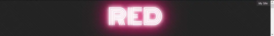
CSS Glow Effect On Hover- Glowing Text
The glowing text effect is can be used on specific text font types, creating a glowing effect of two (2) or more different colors around the text. It could be small, medium or large glowing CSS glow effect. You can create some interesting effects with a different array of glowing colors around each text. It is compatible with Chrome, Edge, Firefox, Opera, and Safari.
[button-green url=”https://codepen.io/bennettfeely/full/BzGVkA” target=”_blank” rel=”nofollow external noopener noreferrer” position=””]Demo[/button-green][button-red url=”https://codepen.io/bennettfeely/pen/BzGVkA” target=”_blank” rel=”nofollow external noopener noreferrer” position=””]Download[/button-red]
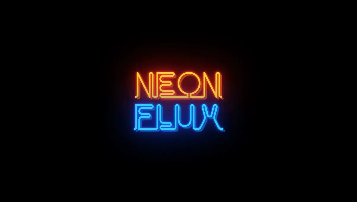
Neon Flux Glow Effect CSS
Neon Flux Sign is created using many overlaid text-shadows. This effect allows the outline of each text to glow in different colors, creating an animated pattern made with shadows. Each text can equally glow in different colors which looks like an outdoor sign for a bar or pub. It is compatible with Chrome, Edge, Firefox, Opera, and Safari.
[button-green url=”https://codepen.io/Trinca/full/NAvpWa” target=”_blank” rel=”nofollow external noopener noreferrer” position=””]Demo[/button-green][button-red url=”https://codepen.io/Trinca/pen/NAvpWa” target=”_blank” rel=”nofollow external noopener noreferrer” position=””]Download[/button-red]
Neon text-shadow Effect
Neon text-shadow effect is an effect created using the text-shadow effect. An effect that makes text shadows glow in any color and in any contrast, allowing you to control the glowing effect of the shadows as well. The text-shadow can be as near or as far away from your text as possible but still give you the best CSS glow effect. It is created in HTML, CSS, and JavaScript, with full Chrome, Edge, Firefox, Opera, and Safari compatibility.
[button-green url=”https://codepen.io/erikjung/full/XdWEKE” target=”_blank” rel=”nofollow external noopener noreferrer” position=””]Demo[/button-green][button-red url=”https://codepen.io/erikjung/pen/XdWEKE” target=”_blank” rel=”nofollow external noopener noreferrer” position=””]Download[/button-red]
Rotating 3D Glowing Text
Rotating 3D glowing text effect is an effect that allows a glowing rotational effect of a text or group of texts on an imaginary axis or around a particular frame. The CSS glow effect is basically from the shadow, the text-shadow can be set to a different color to bring out the glow effect in your text. It is commonly used in motion graphics, mini advertisement inside a widget on web sites and many more. It is created using HTML / CSS and is compatible with Chrome, Edge, Firefox, Opera, and Safari.
[button-green url=”http://cssdeck.com/labs/7y2gz430″ target=”_blank” rel=”nofollow external noopener noreferrer” position=””]Demo[/button-green][button-red url=”http://cssdeck.com/labs/7y2gz430″ target=”_blank” rel=”nofollow external noopener noreferrer” position=””]Download[/button-red]
Neon Glow Text CSS
The Neon glow effect is an effect that can be implemented on any specific text, it gives the text a glow effect that starts from within the text outwards. The CSS glow effect is activated by hovering your mouse on the text which changes as the cursor runs across the text. It is a great effect for creating drop-down menu effects, links, and buttons on websites. It is created using HTML, CSS, and JavaScript and highly compatible with Chrome, Edge, Firefox, Opera, and Safari.
[button-green url=”https://codepen.io/FelixRilling/full/qzfoc” target=”_blank” rel=”nofollow external noopener noreferrer” position=””]Demo[/button-green][button-red url=”https://codepen.io/FelixRilling/pen/qzfoc” target=”_blank” rel=”nofollow external noopener noreferrer” position=””]Download[/button-red]
Conclusion
There is a lot we can achieve with the CSS glow effect, ranging from text shadows to glowing 3D texts. Most of our listed CSS glow effect is free for all users who wish to add these effects on text, menus, buttons and many more for their next website projects. If you are a web designer or web developer, this will enhance and add beauty to the layout and every page of your website/blog. Get yourself acquainted with it these scripts and you might pull off some really interesting stuff on your website or for a client. They are highly compatible with all modern browsers. So, choose from the above list, share your thoughts with us and follow us for more updates.