Hamburger Menu Design CSS are used in triggering a sliding sensation on the menu list while navigating a website. The sliding sensation is as a result of the effect on the ‘Sliding Drawer Navigation Menu’, it adds great responsiveness to a website’s design. They are often tricky to implement. Hamburger menus are generally designed to look just like the actual hamburgers we see and eat every other day. Hamburger menu and icon has 3 horizontal lines which resemble a hamburger. The hamburger menu design and icon was first designed in the 1980’s for Xerox “star” systems to show users where there was a drop-down list. It became popular and was incorporated on a quite a number of systems.
Presently, the hamburger menu can be seen on almost every website or app, you probably must have seen it without realizing what it was. A Xerox system operator, Norm Cox, created the hamburger menu and its icon to help site users get easy access to information links without searching for them on the same website. By just a click on the hamburger icon, the hamburger menu popped up with every information they needed.
You Might Follow This :
Responsive Hamburger Menu CSS Examples
With time, the Hamburger menu CSS has evolved and come a long way. From offering simple navigation to animated or audio enhancements; the layout of Hamburger seems to be ever evolving. The credit for the innovative Hamburger menu designs goes to CSS advancements. Hamburger menus not only maintain a clean user interface but also offer direct navigational access. When building a responsive and an interactive platform is in your mind, one cannot skip including Hamburger menus. Though you may find adding Hamburger menu styles complex, trying them would be worth the efforts!
Here is a list of innovative Hamburger menu CSS animations to include that, in turn, would make our web platform unique and creative. The demo links are incorporated as well, to help you understand better.
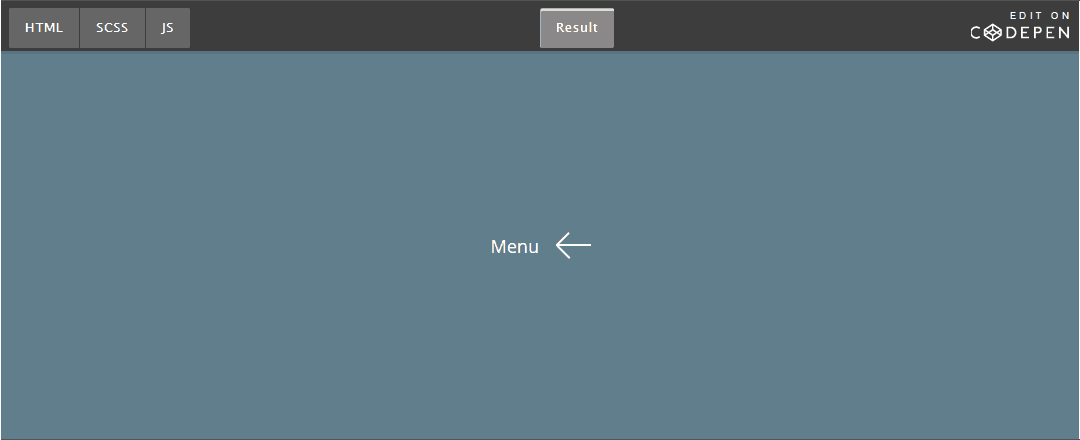
Hamburger Menu To Back Arrow Animation
Simple and classic are the right words to use for this hamburger menu design CSS. It is simple and self-explanatory such that by clicking on the hamburger menu icon, it changes into a back arrow and displaying the navigation menu options. Use the links below to see the demo and also to download.
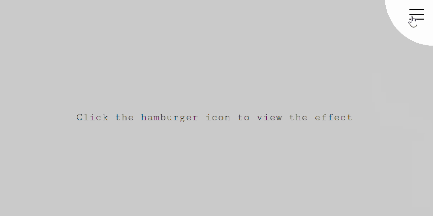
Hamburger Menu Drop Down Navigation
If you wish to give a simple appeal to your web design, this drop-down navigation animation is a recommended option. When you click on the hamburger icon, simply a drop-down menu would pop-up to display the navigation menu.
Hamburger Responsive Gooey Style Design
This effect is a blend of CSS3 attributes and SVG filters. The “Gooey” can be described as a radial menu that tags along with a hamburger toggle button.
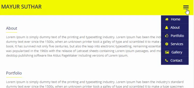
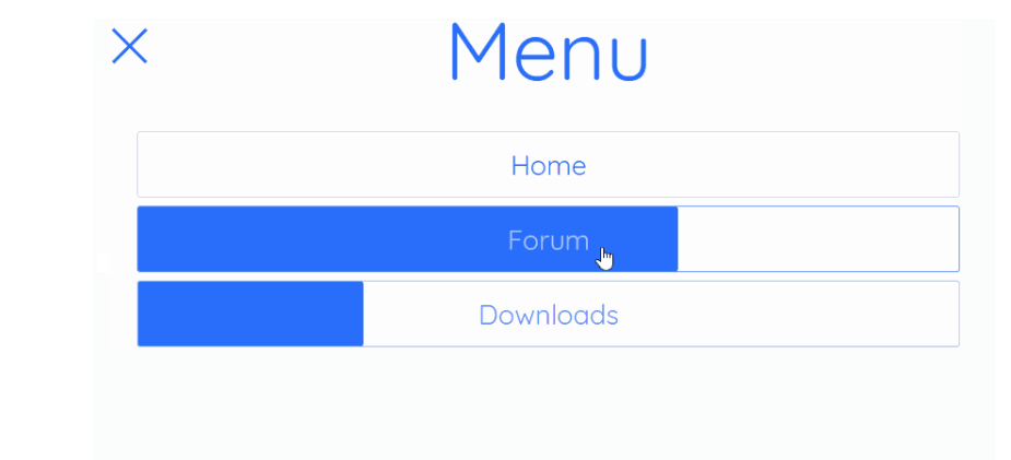
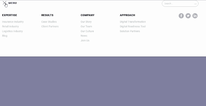
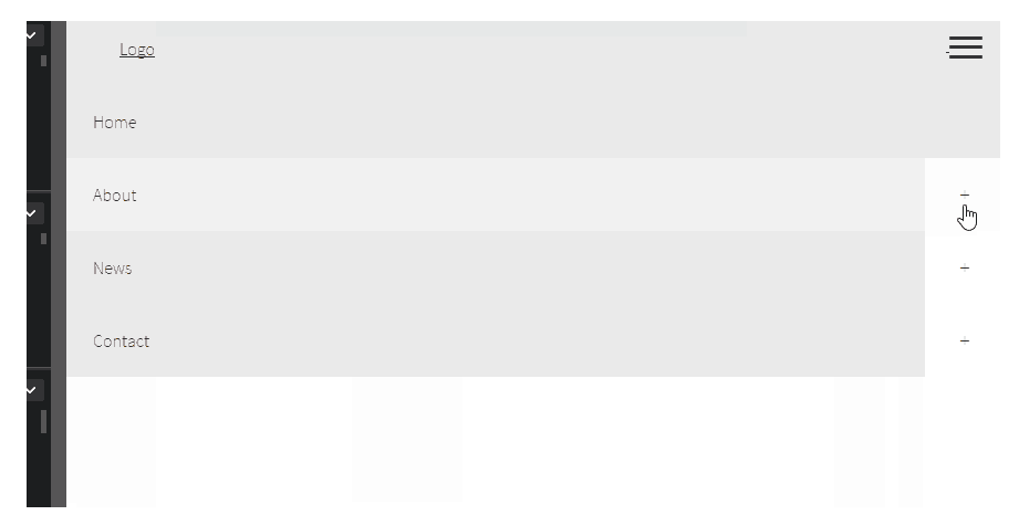
Responsive Hamburger Mega Menu
This hamburger menu is totally unlike what we have seen on this list. Responsive Hamburger Mega Menu allows for the addition of responsiveness to your website’s menu. Mega menus are really useful when a site has a lot of contents to link in the navigation bar. This masterpiece was designed by Mahesh, it allows you to add images to your navbar also. To top it all, its responsiveness allows the hamburger menu to adapt to mobile device screens.
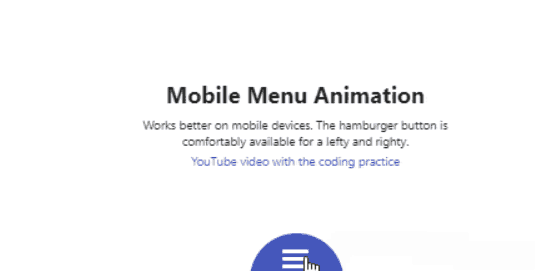
Mobile Friendly Animation Design
This setting is widely accepted across the mobile platform. The hamburger icon is fixed centrally at the bottom of the screen. When a user clicks on the icon, the navigation menu expands to dominate the whole screen in a circular fashion.
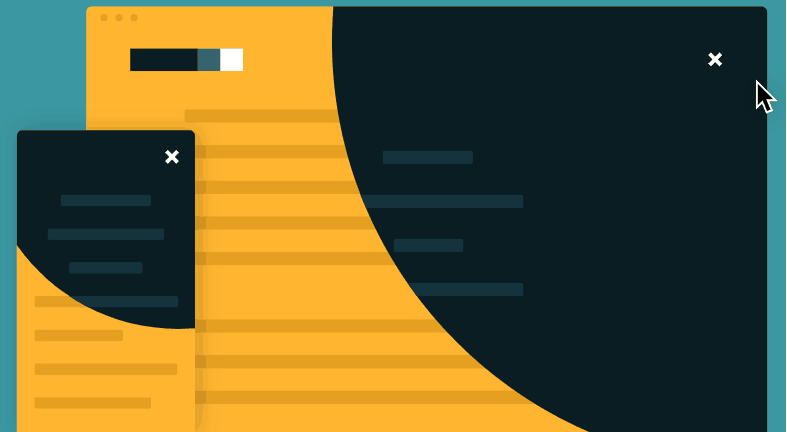
Rounded Navigation CSS
Traditionally, when the hamburger menu expands, the background content is visible on either sides of the menu. But, this rounded navigation menu appears in a circular manner and dominates the full screen. It is a cool effect and a great animation to try.
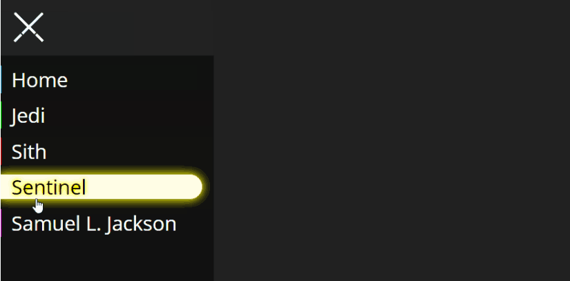
The Star Wars Inspired Animation
This is the coolest hamburger icon to try. If you are an avid fan of Star Wars, this hamburger icon animation would surely entice you.
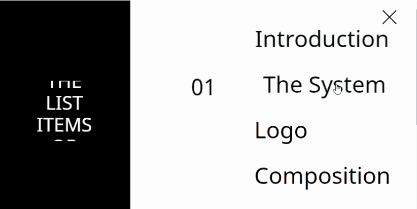
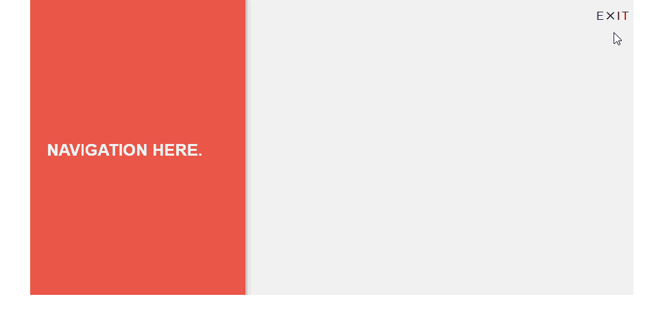
Split Screen Navigation
To enhance the user’s experience, the split screen hamburger animation is deemed as the best. When you click on the hamburger icon, the screen splits wherein; the navigation menu covers the right half with the visual content on the left.
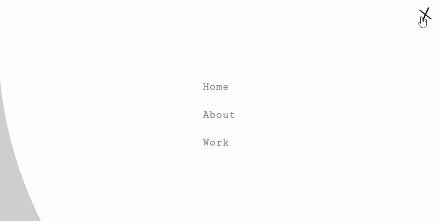
The Full Screen Navigation
This is a simple yet effective hamburger menu animation. Written in pure CSS, when a user clicks on the hamburger icon, the navigation menu dominates the entire screen to give you a better idea of all the menu items. Here’s an eye-catching animated background that appears when one clicks on the hamburger icon.
The Animating Background
A constant background when one opens the hamburger menu is common, but when the animation or aptly the dynamic effect is added to the background, the web design looks no less than perfection.
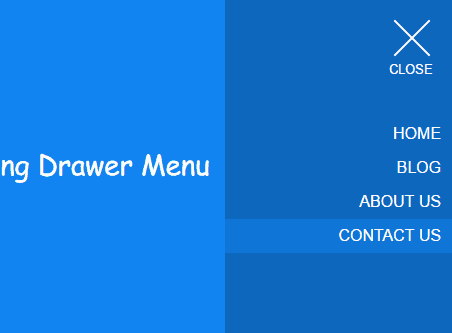
Morphing Drawer Menu CSS
This is a creative navigation menu that is built by embedding features of HTML and well as CSS/CSS3. Be it the creative touch or the easy to understand interface; morphing drawer menu is trending in the world of web and app development.
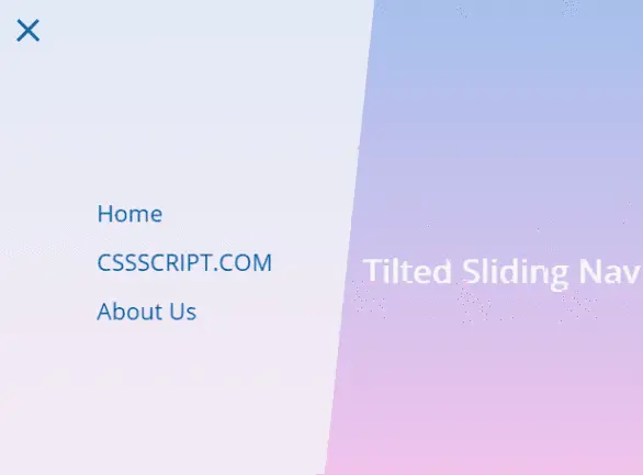
Bootstrap Tilted Sliding Navigation
This menu is a combination of animated hamburger icon and a tilted navigation menu. Built with the help of JavaScript, Clip path, and CSS3 animation attributes; the tilted sliding navigation is highly in demand.
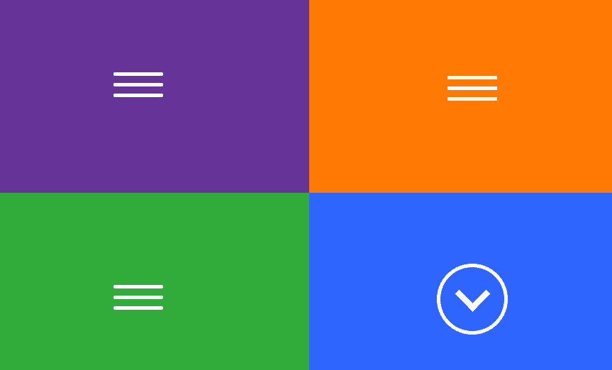
Responsive Horizontally Aligned Menu
The vertically aligned hamburger navigation is common, but the horizontally aligned navigation menu is a new addition to the creative animation designs. When one clicks on the hamburger icon, the menu is displayed on the top that slides down in a horizontal fashion.
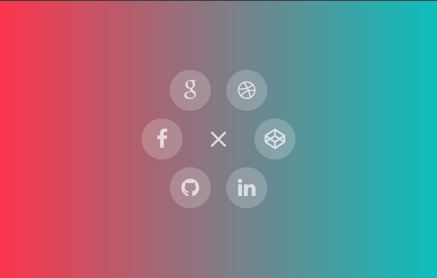
Toggle Menu With Social Iocns
The hamburger menu is centrally located. When one clicks on the hamburger icon, the menu slides from the top and occupies the major portion of the screen. You can further navigate to the desired page from the menu.
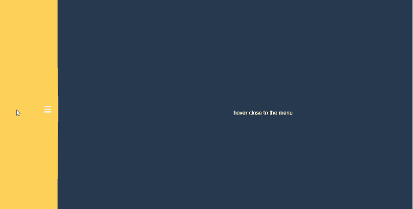
SVG Hover Menu
Another attempt at creativity, the SVG hover menu tracks the mouse position to display the hamburger menu. The hamburger icon is placed centrally on the left screen end and when one clicks on the menu icon, the menu slides creatively to display the menu. Have a look for yourself.
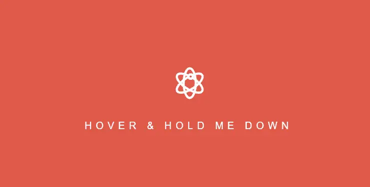
Atomic Hamburger Menu CSS
This is designed by Alex Coven, it is made with the feel of atomic elements. Hover over the hamburger icon to see the atomic logo, then click and hold to see the X. This is so simple and best for research, health and pharmaceutical sites. To see a demo, use the links below.
Flipping Hamburger Menu Toggle
Here is another special hamburger menu design, it flips and adds fun with toggle effects made possible by CSS animations. When you click on the hamburger icon, it flips like drummers flip drumsticks and transforms into X. this is a cool effect and would add beauty to any site. Check it out using the link below.
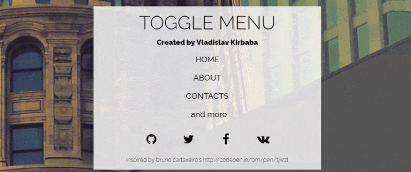
Sidr – Sliding Menu
This is an ultimate Hamburger menu that automatically integrates to its features and fits perfectly any screen size. The Sidr is a popular j-Query belonging to the Canvas menu. By using the Sidr, you can easily slide your content from right to left to enhance a better view point. 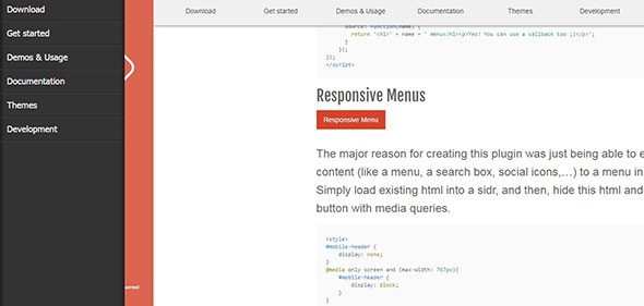
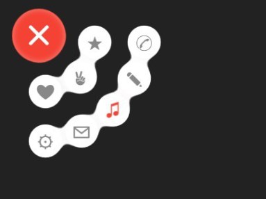
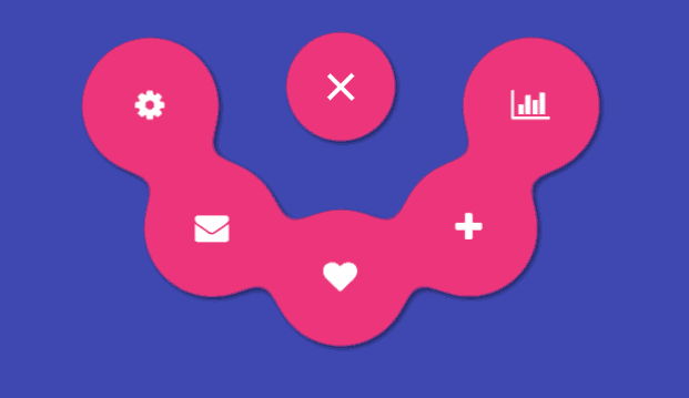
Colourful Flower Popup Menu
Lastly, on our list, today is the cool colourful hamburger flower popup menu. This menu pops out like a sprouting flower hence the name. This is just cool and agonizingly cool, simple and colourful. Check it out using the links.
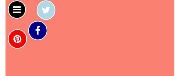
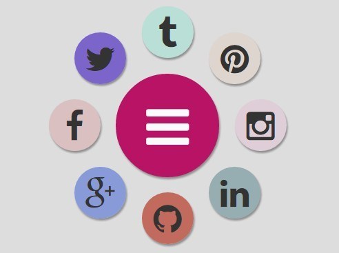
Hamburger Menu for Social Sharing Icons
Social sharing icons are provided in the Hamburger menu which is used in various navigations tasks. However the social sharing icons are concealed from User Interface and only emerge after clicking the menu icon.
Slide in Navigation Menu with Off-Trigger Area
It is a perplexing hamburger menu type entailing creative and unique animation effect. I recommend you try it in your projects for a stunning outlook on either an app or website. 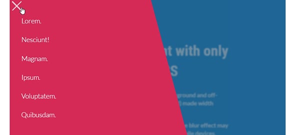
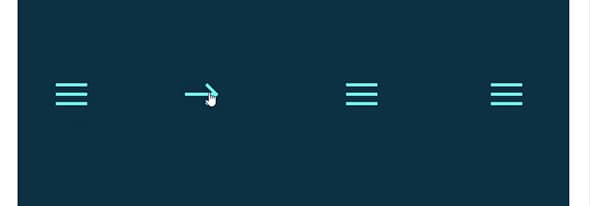
Multiple Hamburger Menu Animations
The multiple hamburger menu animation provides you with a variety of bar design, unlike the generally utilized hamburger navigation.
Hamburger Menu Modal Pop Using GSAP
It is more reliable hamburger menus especially when you want your mobile applications have a stunning outlook. The design consist a modal popup which becomes activate when you click on it.
Off Canvas Menu with 3D Effect
It is a more creative hamburger menu that features a decorative 3D Effect. It is more eyes captivating.
Hamburger Open Animation Menu
Hamburger open animation menu changes when it is clicked. Its transformation is catchy and stylish, the top and bottom lines of the hamburger icon change into a circle while the middle line transforms into an X. This is a wonderful piece of work by Sarath AR. Check out the demo and download link for more.
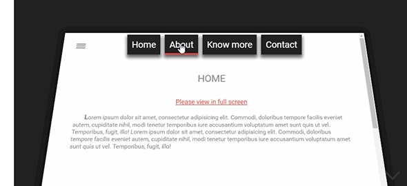
Hamburger Menu to Full Navigation in CSS
It is another design of hamburger navigation type which transforms a full menu into a full-screen view. You will truly love its smooth transition feature when you try it. 
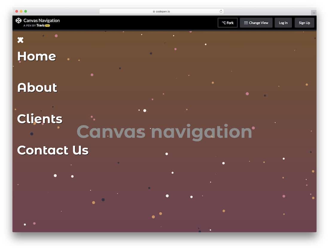
Canvas Navigation HTML5
It is a vertical hamburger design based menu. It offers a background animation effect when you expand the menu making it different from the other hamburger menu design.
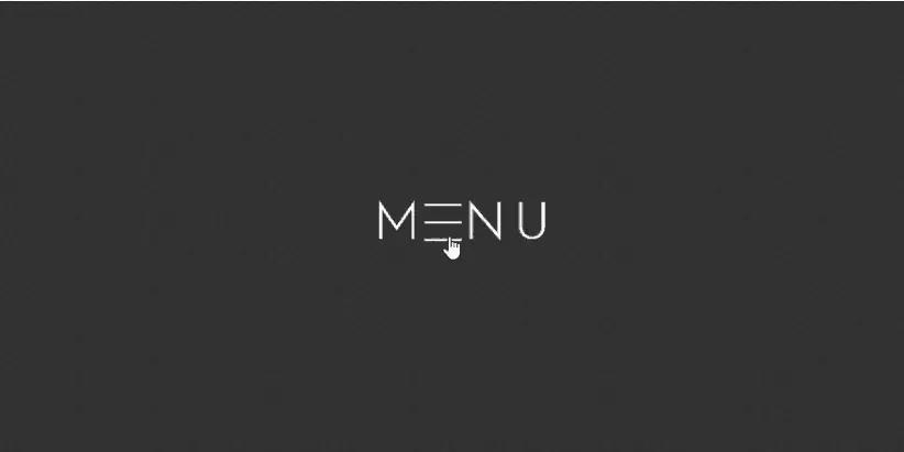
The “Menu” Transformation Icon
This is the newest form of animation, where when a user clicks on the hamburger icon, it transforms into the word “MENU.” It is a code purely written in CSS, which is doing rounds in the market owing to its innovative design.
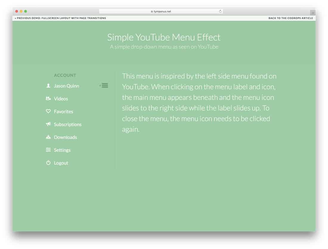
YouTube Menu Effect
Here is another sleek and quick hamburger menu design that blends perfectly on both mobile and desktop version. It gives you more experience on a non-variable navigation menu across the various modules. It entails various unique animations and sufficiently compliment YouTube menu.
Expanding Burger CSS
Our first hamburger menu design CSS is sleek and will add beauty to your website. The hamburger upon implementation on any site can be seen at the top-left corner of the website. It expands upon clicking the 3 horizontal lines. Check out this web element’s demo using the link below.
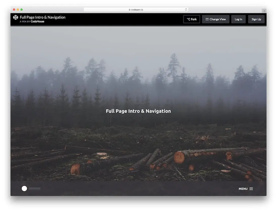
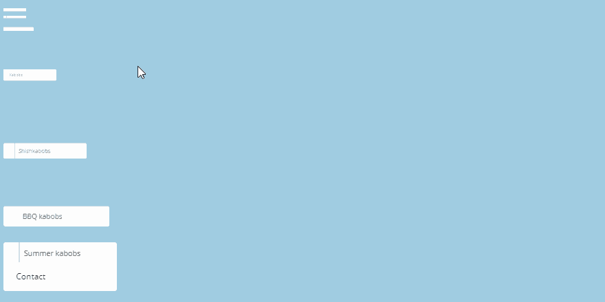
Full-page Intro and Navigation
It utilizes a creative design of hamburger menu type. It utilizes the bottom hamburger menu for navigation instead of the top hamburger navigation type. When you click on the hamburger menu’s icon, it fits perfectly the whole page by sliding to bottom from top. You can easily dismiss the full-page by going all the way up again.
Burgers & Sliders Navigation Menu
Burgers & Sliders Navigation Menu is designed to slide out a multi-level navigation menu when clicked on. The navigation menu slides out from the left in a modal window or pane. Check it out using the links below.
Icon Animation
Made by Marius Balaj, hamburger menu icon animation is another simple but good element to implement on any website. This hamburger menu design CSS has animated scroll effects, so when you hover your mouse over the hamburger menu icon it slides out the menu items. Use the links below for a demo and to download.
Pure CSS Hamburger Menu Slide-In
This hamburger menu design CSS lets you expand the menu by clicking on the sidebar navigation menu at the top left corner. Its design is simple and perfect for websites that have to do with tech, web design, branding, advertising and more. Check out the demo and to download this pure CSS hamburger menu slide in using the links below.

Hamburger Menu to Sidebar Navigation Menu
This hamburger menu to sidebar navigation menu is the transformation of the hamburger menu icon into a sidebar navigation menu with just a click and by clicking the X icon, it collapses back to its normal hamburger menu state. If you are a lover of style and finesse, then this hamburger menu design CSS is for you. Check out the demo and download links below for more details.
Gooey Hamburger Menu Icons
This is another fluid hamburger menu design that looks sleek. It takes the form of liquid splatter, with an X to go back to the normal hamburger menu. Check out the demo and download link for more.
Bootstrap Hamburger Menu Animation
Here is one of the simplest hamburger menu icon. It is designed by Dicson, the high point of this hamburger menu design CSS is when the icon is clicked, it transforms into a single line and then into an X mark; all in seconds. Use the links below to see a demo and also to download this menu element.

Hamburger Menu To Exit Animation
This is another hamburger menu design CSS. It is designed to reveal the ‘Menu” text when you hover over it, this transforms into “Exit” when clicked on; it then slides out the navigation menu. It is designed by Robin Bertilsson. Use the links below to see a demo and to download the element.
Hamburger Menu Animation CSS
This hamburger menu design has a small hover effect. The hover animation effect moves like a ripple or an equalizer. It is simple and good for tech and finance sites. It is greatly designed by Derek Morash. Check out the demo using the links below.
Three Vertical Dots Menu
Just like its name implies, this three vertical dots menu expands based on the actions carried out by the site user. By hovering over the hamburger menu icon, it transforms into the word “Menu” which when clicked; shows the menu items and the word ‘menu’ changes into “Close”. It is clear and shows the action of the button. This menu icon was designed by Ryan Canfield. Click on the links below for a demo and to download this menu icon.
Drawn Hamburger Menu Transition
Drawn hamburger menu transition, is a stylish design by Jesse Couch which adds fun to the hamburger menu icon transitions. This hamburger menu design when clicked upon, transform into an X. The fascinating thing is the fact that; the transition is designed to like it is drawn by hand.
Simple Navbar Toggle To X
A simple combination of CSS and JS makes up this impeccable hamburger navbar which changes into an X on click, and back to a hamburger when the X is clicked. This hamburger menu design is written in vanilla JS and requires no dependencies. Use the links below for the demo and for download.
Hamburger Icon Animation
The animation for this hamburger menu is done using CSS and jQuery. This makes its transformation awesome, with a click the four horizontal lines change into an X and at the same time displaying the navbar. This is simple and direct for any website. Follow the links below to see a demo before downloading.
3 Dot Icon Navigation Menu
Pure CSS fullscreen navigation menu expands into a fullscreen navigation menu when you click on the hamburger icon at the top right corner. By clicking the X icon, it goes back to its hamburger menu state. This hamburger menu style is designed by Håvard Brynjulfsen and it is highly recommended for those who would want to keep things clear and straightforward on their sites. Check out the demo using the link below.
Hamburger Menu Button
If you are looking for class, this is definitely it. Hamburger menu button is designed with style, this can be seen from the hamburger icon horizontal lines. The top and bottom lines are short in opposite directions making it look really nice. It transforms into an X while sliding out the navigation menu items. See the demo and download links for more information.
3D Hamburger Transformation Menu
Another beautifully designed hamburger menu design CSS. The 3D hamburger transformation menu changes into an X, with a zig-zag transformation effect when clicked upon. Clicking on the X takes it back to the hamburger menu. Follow the links below for demo and download.
Click Me! Hamburger Menu CSS
Click me! Is one hamburger menu that has its own unique transformation effect, unlike others that are almost the same. The transformation starts with one of the 3 horizontal lines on the hamburger menu icon jumping off, while the remaining lines form the X. This is a nice design and can be used on all websites.
Shifter Hamburger Icon
Another type of Hamburger icon is a shifter menu that entails a variety of animations effects. You can utilize the shifter menu when dealing with mobile applications or websites. 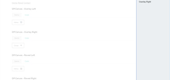
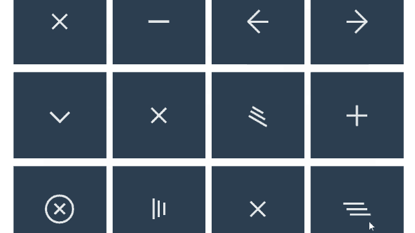
Hamburger Icon Animations Collection
For those who are indecisive about what type of hamburger menu icon they want to implement on their sites, this is definitely packed for you. It is a collection of 12 different hamburger menu design CSS. Check the demo and decide which one you want on your site.
Hamburger Menu Elastic
Second on our list is the hamburger menu elastic, which is designed using HTML, CSS, and JavaScript all combined to give it a superb effect. Hamburger elastic has an effect when you click on the icon, it bounces and then displays a drop-down list/links to contents. It can be placed at the top right, left, centre or bottom corners on any website or application. Click the links below to see a demo and also to download this item.
Responsive Mega Menu Snippet with Expandable Sections
It features expandable parts which display suitably in any size of screen. It enables you to add images on the navigation menu.
Hamburger Icons Animations
This is another fluid animation using pure CSS. It is also a gooey hamburger menu but this time it is placed by the top side corner of a site. When normal, the hamburger menu is visible but changes into an X with the liquid splatter effect displaying the navigation options. Use the links below to see a demo and to download this hamburger menu.
JQuery Standard Drawer Menu Icon
If you want a j-Query plugin with excellent performance a standard drawer menu will be the best option especially for simpler task. This makes the standard drawer a more effective and sufficient transition design of animation. You can tap on the present navigation icon when opening, closing or checking the standard drawer. 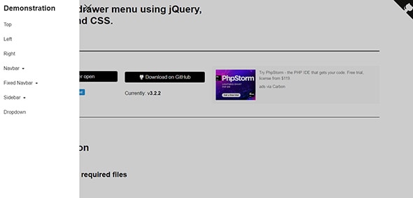
Open Close Hamburger Menu Icon
SVG hamburger menu icon is uniquely designed with pop motion. It pops the navigation menu when clicked and changes to an X which takes it back to its normal hamburger menu. This is simple and clear for any website. Check out the demo using the link below.
The Doughnut Menu
Nowadays, the art of web designing has taken an upturn. When it comes to experimenting with hamburger animation button, the doughnut menu takes the brownie points. When a user clicks on the hamburger icon button, the navigation menu appears in the shape of a doughnut.

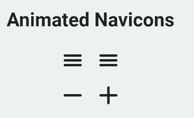
Hamburger Animated Navicons
Mobile app developers and users are not left out on this. The GSAP hamburger menu modal pop is ideal for that next project you are planning or currently working on. By just a click, the navigation menu pops up with links to other contents. Check it out using the links below.
[button-green url=”https://codepen.io/hugo/full/LmJsf” target=”_blank” rel=”nofollow external noopener noreferrer” position=”left”]Demo[/button-green][button-red url=”https://codepen.io/hugo/pen/LmJsf” target=”_blank” rel=”nofollow external noopener noreferrer” position=”left”]Download[/button-red]
Circle Hamburger Menu
When you point your cursor at the hamburger icon, all the menu items would be displayed in a circular format placed around the central icon. It is a pure HTML/CSS based representation and tops the popularity charts as per the current trends.
Pure CSS Circle Menu
Pure CSS circle Menu is one unique and fluid hamburger menu design. It is a perfect design for an advertising agency, e-commerce, media sites and more. The hamburger menu pops into a doughnut right in the centre of the page when clicked with an X in the middle to go back to normal. This is surely one hamburger menu you would love to use over and over again. Use the links below to see a demo before downloading.
Conclusion
These are 70 latest Hamburger menu CSS designs that are popular and are been readily adopted by web designers. The designs are suitable for both the websites and the mobile applications and should be preferred when you want your business to stand out. Try any of the listed hamburger menu animations and build a platform that promotes effective and friendly communication between the web platform and the user. Lastly, the hamburger icon is a widely accepted symbol that is now recognizable to any internet user, but what set it apart are the creative animations. So, invest in innovative hamburger menu designs and pave way for better user traffic and thus better sales.