A lot of designers have incorporated hand drawings and sketches into their website designs. These designs usually reflect the individual or the owner of the website. Some designers have chosen this because they believe it passes the information in a more intimate and emotional way. Aside from its heartfelt way of passing information, sketches and drawings make a site more beautiful and give it a human touch.
Best Examples Of Sketched Website (UI Designs)
Additionally, these sketches are used to frame and give support to the content. The designs add spice and glamour to a very simple content. It makes a site appealing and friendly due to the mix of several images. These images could also portray the content in another light and aid the understanding of users.
We have compiled a list of 20 creative websites with sketch designs. Surf through them and thank us later!
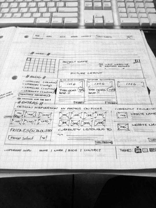
Personal Website UI Sketch
The design used in this site is very busy. It has sketches of different elements ranging from animals to buildings and other things. Each of these elements has a colour that adds spice to the site and supports the very little content written in this site.
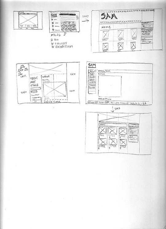
SAM-Website Sketches
Camellie used a sketch design for her portfolio website. This design gives the website an intriguing look. Although the introductory texts are in just three content boxes, the sketches of animals and cloud would always attract any user to the site.
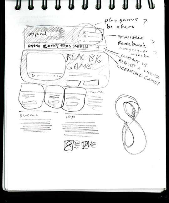
OoPixel Website Paper Sketch
Unlike the two we mentioned earlier, the heathersloane has more texts. Here the sketch just serves as a form of support to the text. The sketches do not overshadow the texts and vice versa. It is a beautiful blend of both words and sketches.
Web Sketch
Just like the name, the website design is exclusive and unique. It is a beautiful mix of both images, sketches and texts. It has an amazing and catchy colour scheme with different sketches being painted different colours hence does not look like the traditional pencil sketch.
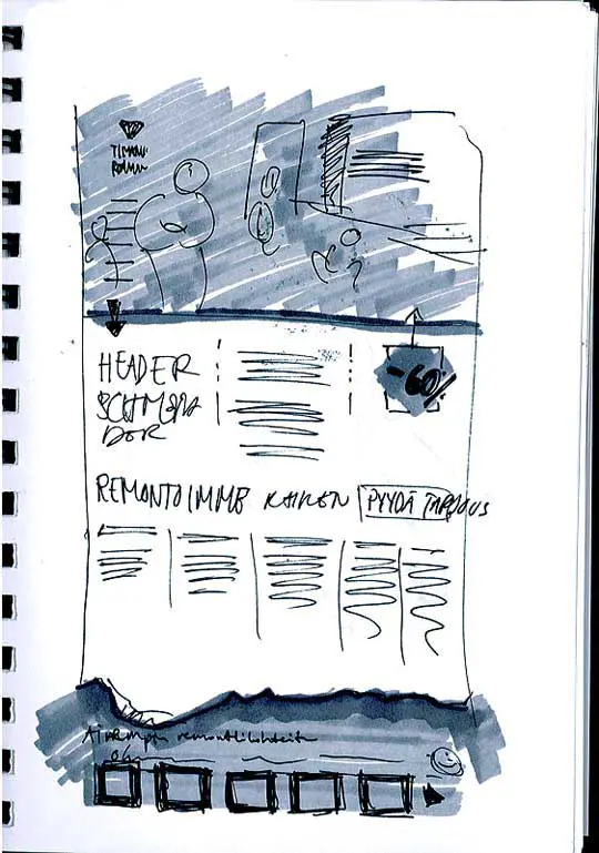
Timanttiremontti.fi Website Initial Sketch
Are you looking for a sketch design that would inspire you on how to design your portfolio page? Then this is for you. This sketch design is fascinating and unique. It has a mix of amazing sketches and colours with a brief but very detailed introduction that would entice the reader to go further.
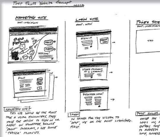
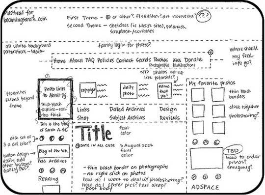
The Washington Post – Post Points Website Sketch
Just like the name, it is perfect for music and art promotion. It has a picture of a man playing the guitar which is a symbol for music and it has dates of music events. Most American music artists use this sketch design on websites in order to promote their tours and concerts.
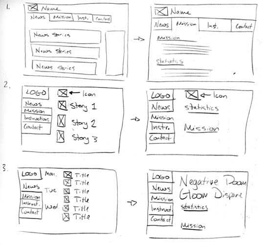
Website Sketches
In this website, sketches appear on navigation buttons. These buttons make it easier to access the certain required information. The sketches on this buttons make them interesting and catchy. Although the sketches might seem weird, it is the weird nature that makes it more attractive.
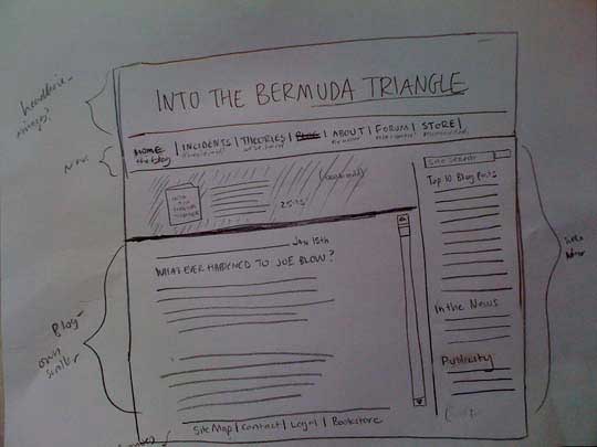
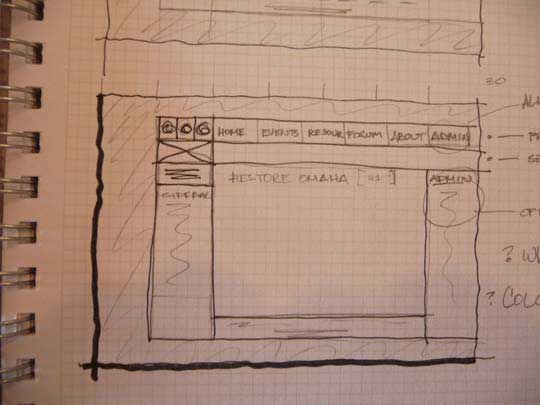
Bermuda Triangle Site Organization
Just like the name, this is an actual work of art. It is an amazing object and colours. It has a content box where other relevant information can be written such as the history of the site and services rendered. This sketch design can be used for acting, music and blogging sites. Its fascinating nature makes it suitable for this purpose.
Website Thumbnail
Although some designers refer to the personal portfolio sketch design as being too busy, it is amazing. Due to its loud and playful nature, this sketch design is not suitable for professional websites. It is suitable for personal portfolio websites and kids’ websites too. Its loud nature attracts more readers and visitors to the site.
Original Sketch
This particular design is a full definition of creativity. It has a sketch of a tree-like human with some amazing colours. This design could be used on sites that have to do with creativity and talent in order to interest the readers. It could be used for personal portfolio websites, art display websites and even music sites.
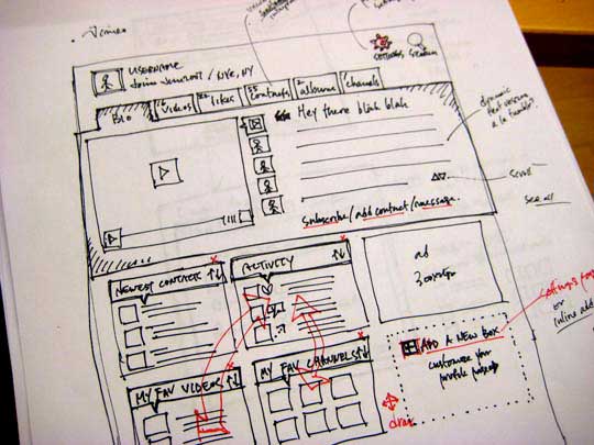
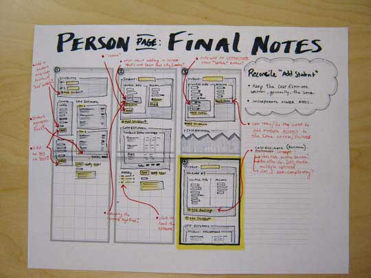
Vimeo Profile Page Idea
Unlike the other sketch designs, it is quite obvious that this design is a sketch. Other sketch designs are painted and mixed with different images and contents but this particular design is not. It has a beautiful black and white background and can be used for websites for stores, fashion houses and other sites for small scale retail businesses.
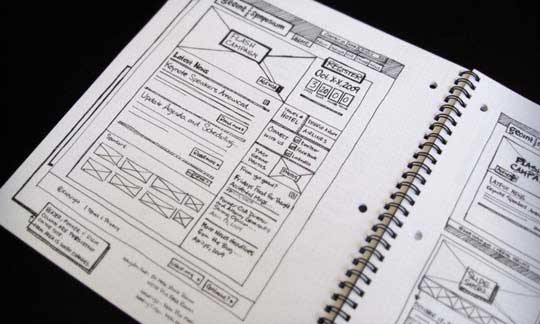
GEOINT2009 (Microsite)
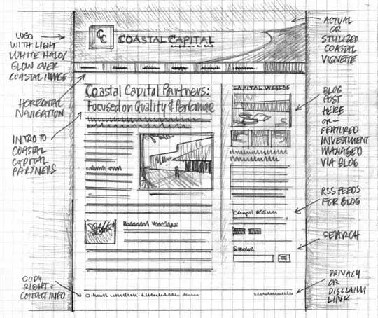
The design in this website is so unique and simple that it conveys powerful and important messages in a simple, exquisite and amazing manner. Aside from the funny but intriguing drawing in this sketch design, there are spaces where the names, phone numbers and social media handles are written. As we can see in the image below, this sketch design is best for portfolio websites.
Coastal Capital Partners Wireframe Sketch
Personally, the sketch design on this website is my favourite. It is quite subtle although the site is laced with other creative and amazing images that would definitely leave readers struck. This site has an amazing colour scheme, well-structured and adequately placed texts with beautiful images that makes the site irresistible.
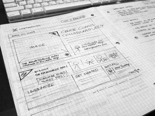
Cartoonity.com UI Sketch
The sketches in this website give first-hand information on what the site is all about with content boxes where contacts and social media handles are displayed. This sketch design can be adopted by hairdressers and those who sell hair and beard products.
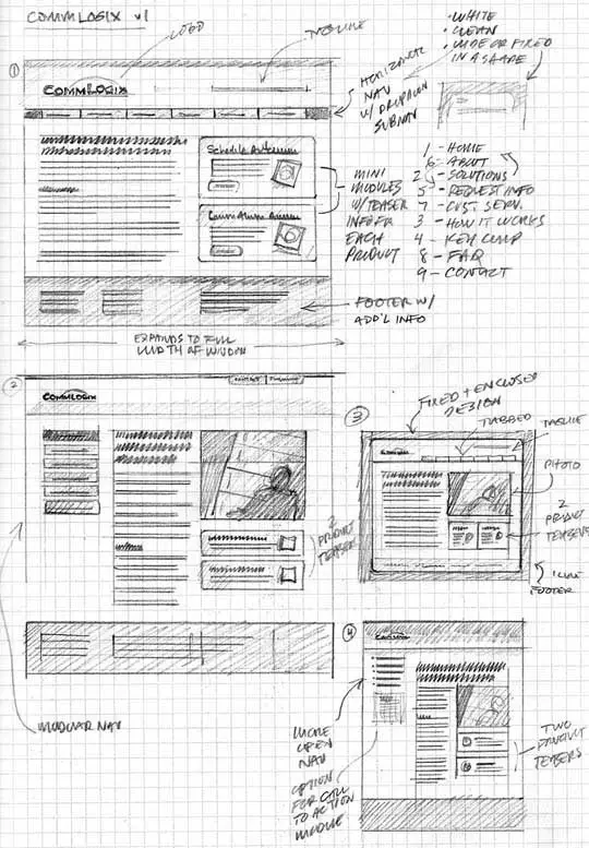
CommLogix Wireframe Sketch
Unlike the rest website sketches, this sketch has a professional look. Although it does not look completely professional, it can be used on websites for businesses and stores with the sketch giving it a playful but serious look. Some designers use this sketch for professional websites in order to ensure the site does not look boring.
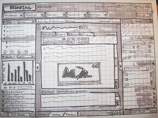
Librespeak Interface Sketch
Are you looking for a design that’s very catchy? Are you looking for a design for a children website? Then this is for you. Although this design is very busy because it has a lot of sketches and texts infused, it is still interesting and displays vital information and images about a site.
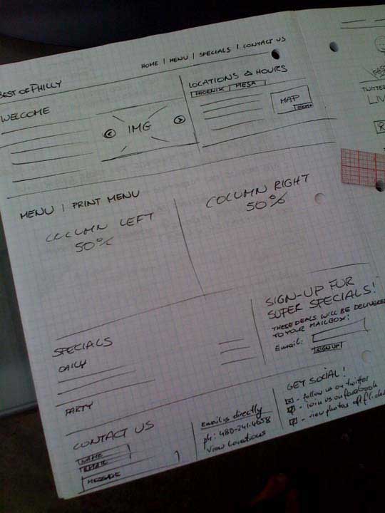
Best of Philly Sketch
Just like the name, it is perfect for an art studio. This design displays creativity that is expected of an artist. So using it for a website of an art studio would definitely attract more users. They would want to explore a site and studio with such an amazing cover design.
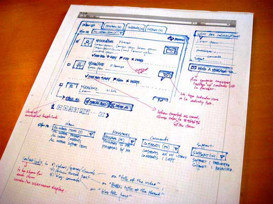
Vimeo Conversations Page Ideas
Just like the name, the design here is creative and unique. The sketch serves as a support for all of the texts written in the content boxes. It adds a unique look to the site. The design can be used for websites of agencies that render ICT and networking services.
Sketching
Jason Gray is an American gospel musician who also made use of sketch design for his website. He placed a link that leads directly to a site for ticket booking. Some other musicians and designers can adapt this sketch for music and art sites as this particular design breathes creativity.
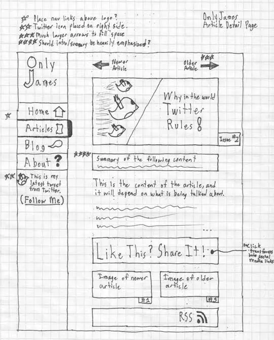
OnlyJames Wireframe Sketch of Article Detail
This sketch design site looks quite professional. Although certain designers do not still find it feasible for corporate worlds. The actual sketches appear at the top and both sides while contents are written in the middle. The colour scheme and text structure make the site irresistible.
Conclusion
Although sketches beautify a website, it is not suitable for corporate and professional sites. These sketches always come in handy for bloggers, artists, and musicians as it allows them to fully express themselves and engage their audience.
We hope this article was helpful. Please share with your loved ones and visit our social media handles for more exciting and educative articles.